Configure the User Interface
The tinacms package provides two possible user interfaces: the sidebar and the toolbar.
The main difference between the two UIs is aesthetics. Both provide access to Screen Plugins and buttons for saving and resetting Forms. The main difference is in how they expect the Form's content to be edited: Form's are rendered within the sidebar, while the toolbar is designed to work with Inline Editing. Also, widgets can be added to the toolbar as plugins, as in the case of the Branch Switcher provided by react-tinacms-github .
Enabling the User Interface
By default neither UI is enabled. You can enable one (or both) by setting their flags to true in the TinaCMS configuration:
new TinaCMS({
  sidebar: true,
  toolbar: true,
})
This will enable the UIs with their default configuration. If you need to configure either UI further, you can pass that object instead:
new TinaCMS({
  sidebar: {
    position: 'displace',
  },
})
Let's take a look at the configuration options for each UI.
Sidebar Configuration
interface SidebarOptions {
  position?: 'displace' | 'overlay'
  placeholder?: React.FC
  buttons?: {
    save: string
    reset: string
  }
}| key | usage |
|---|---|
| position | Determines sidebar position in relation to the website. 'displace' (default) moves the whole site over; 'overlay' slides the sidebar on top of the site. |
| placeholder | Provides a placeholder component to render in the sidebar when there are no registered forms. |
| buttons | Deprecated — Configure on the form instead: Customizes the string displayed on either the 'save' or 'reset' buttons. |
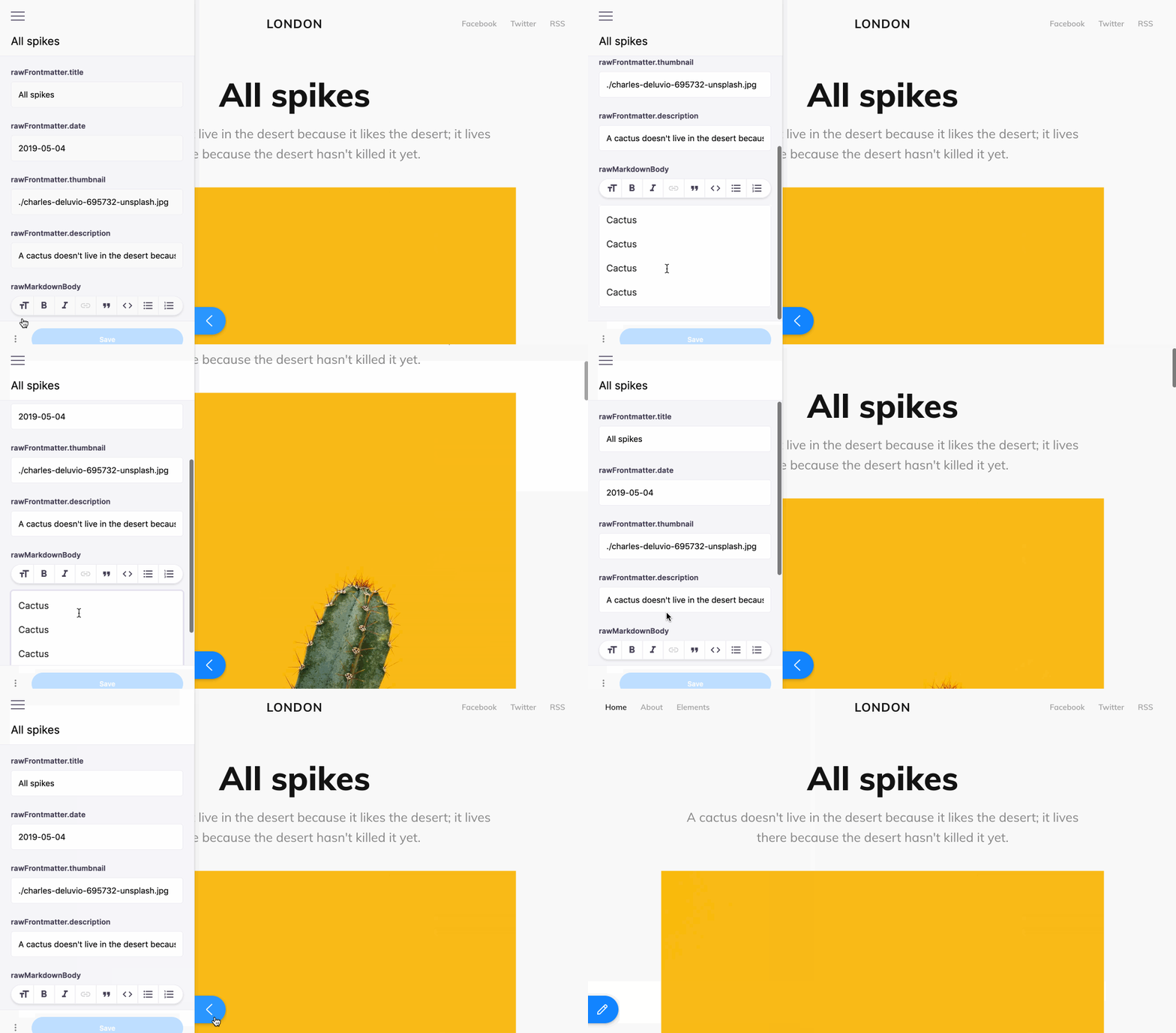
A site configured to use Tina will display a blue edit button in the lower-left corner. Clicking this button will open the sidebar.

Sidebar contents are contextual. For example, when using Tina with Markdown files, a conventional implementation will display a form for the current page's markdown file. In the event a page is composed of multiple files, it is possible to add multiple forms to the sidebar for that page's context. All forms available in the current context will then be displayed.
Toolbar Configuration
interface ToolbarOptions {
  buttons?: {
    save: string
    reset: string
  }
}| key | usage |
|---|---|
| buttons | Deprecated — Configure on the form instead: Customizes the string displayed on either the 'save' or 'reset' buttons. |
On its own, the toolbar will display the 'Save' and 'Reset' buttons, along with a form status indicator to show whether there are unsaved changes. Custom Widgets can also be added to extend functionality for the particular workflow.
Note: It is now recommended to configure the 'Save' & 'Reset' button text on the form intead of in the UI options. Please note that if
buttonsare configured on the CMS through thesidebarortoolbaroptions (as in the examples below), those values will take precedent over custom button values passed to a form.
Examples
With Gatsby
You'll want to pass in this option to wherever the plugin is registered in the gatsby-config file.
gatsby-config.js
{
  resolve: "gatsby-plugin-tinacms",
  options: {
    enabled: process.env.NODE_ENV !== "production",
    sidebar: {
      position: 'displace',
      buttons: {
        save: "Commit",
        reset: "Reset",
      }
    },
  }
}
With Next.js
If you followed the implementation in our Next.js docs, you'll want to go to the _app.js file where the CMS is registered. Again, depending on your setup with Next + Tina, this config may look slightly different. Note this is also where you might specify the sidebar display options.
pages/_app.js
class MyApp extends App {
  constructor() {
    super()

    this.cms = new TinaCMS({
      toolbar: true,
    })
  }

  render() {
    const { Component, pageProps } = this.props
    return (
      <Tina cms={this.cms}>
        <Component {...pageProps} />
      </Tina>
    )
  }
}